
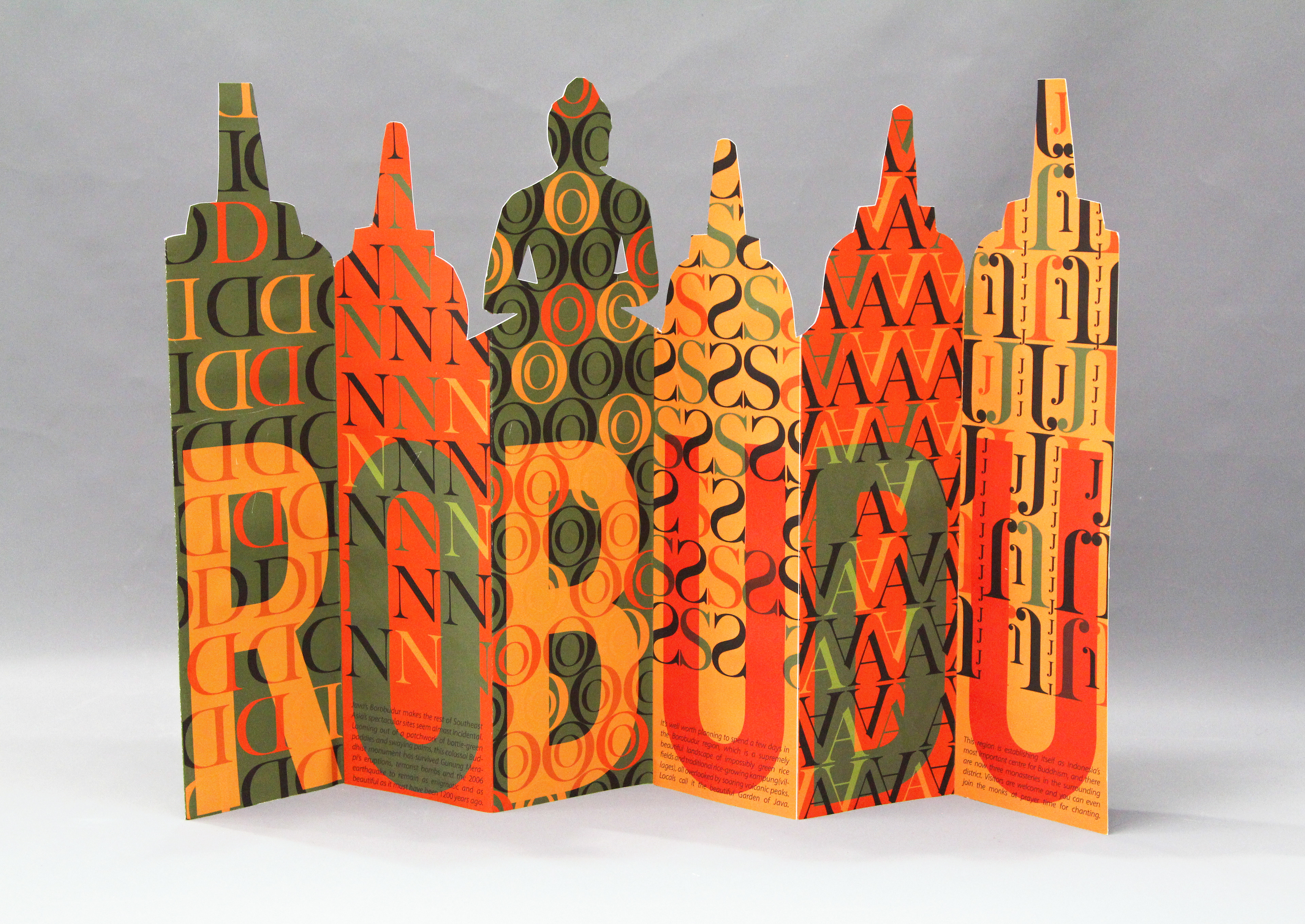
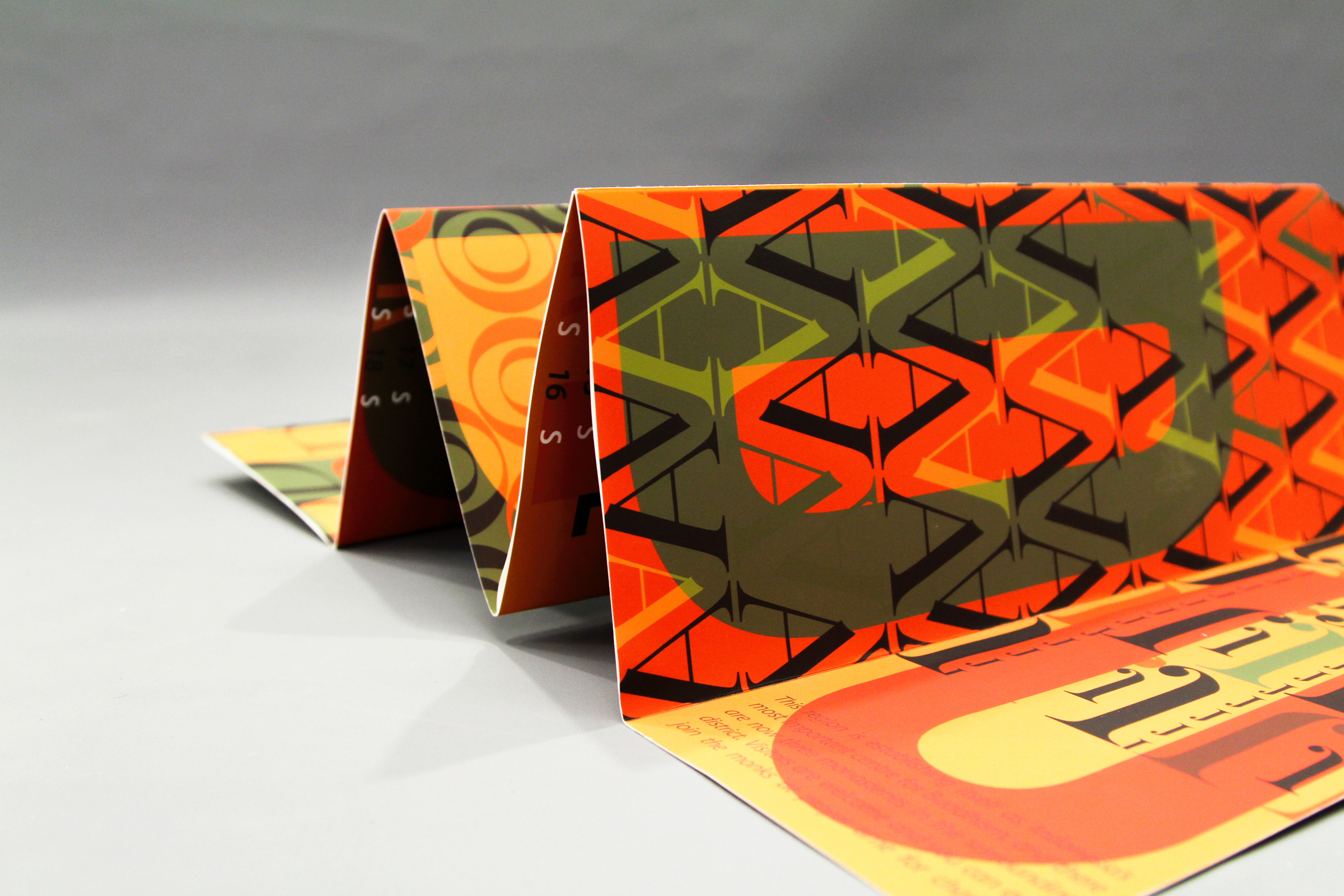
Introduction: This specific assignment was based on two previous projects, where we had to pick a location anywhere around the world, and make a readable calendar out of it. My place was, Yogyakarta, Indonesia and I based my calendar off of the Borobudur Temple which is one of the world’s largest Buddhist temples there. The color palette I decided to work with was created from a photograph of the Lion Dance Costume.
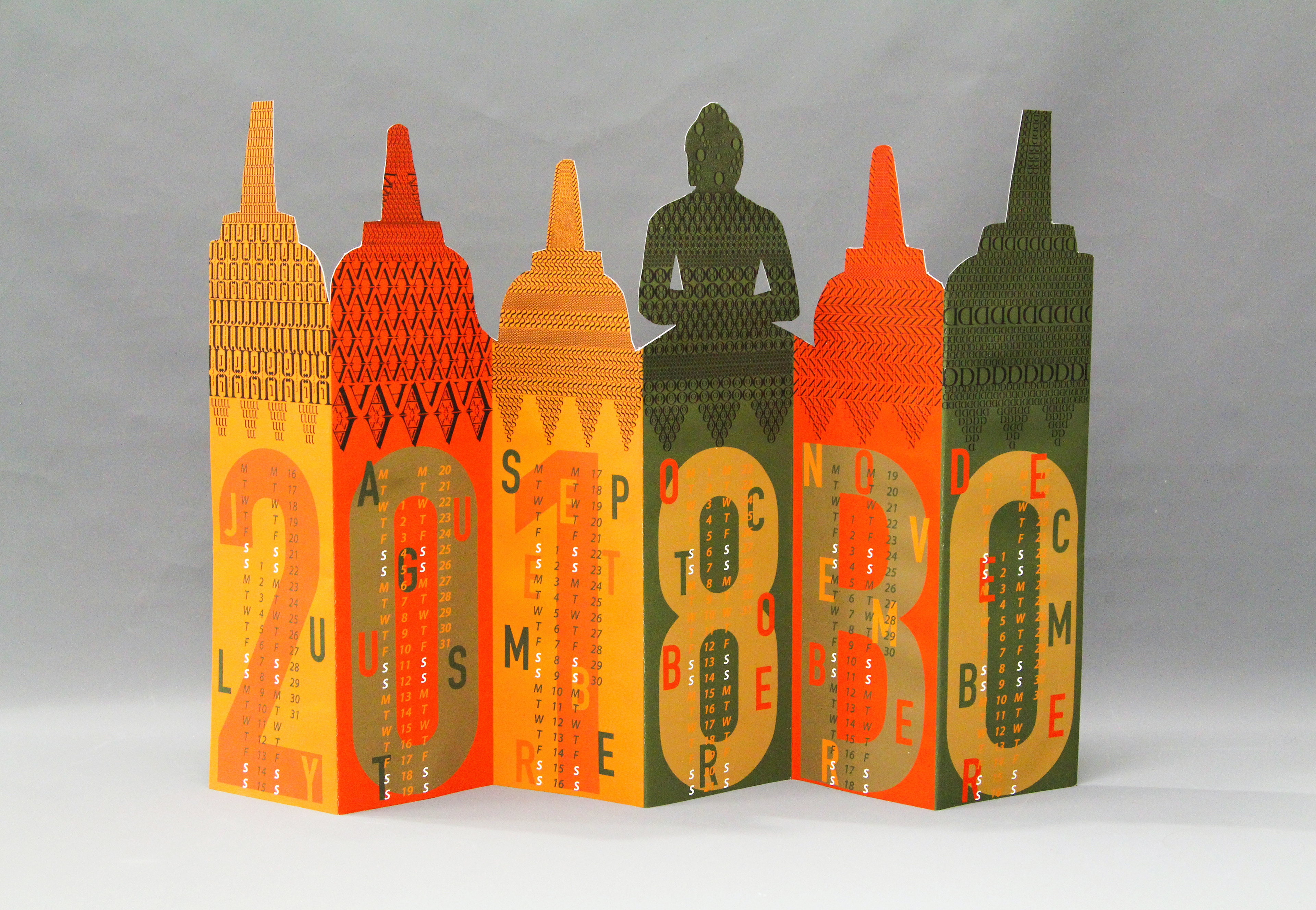
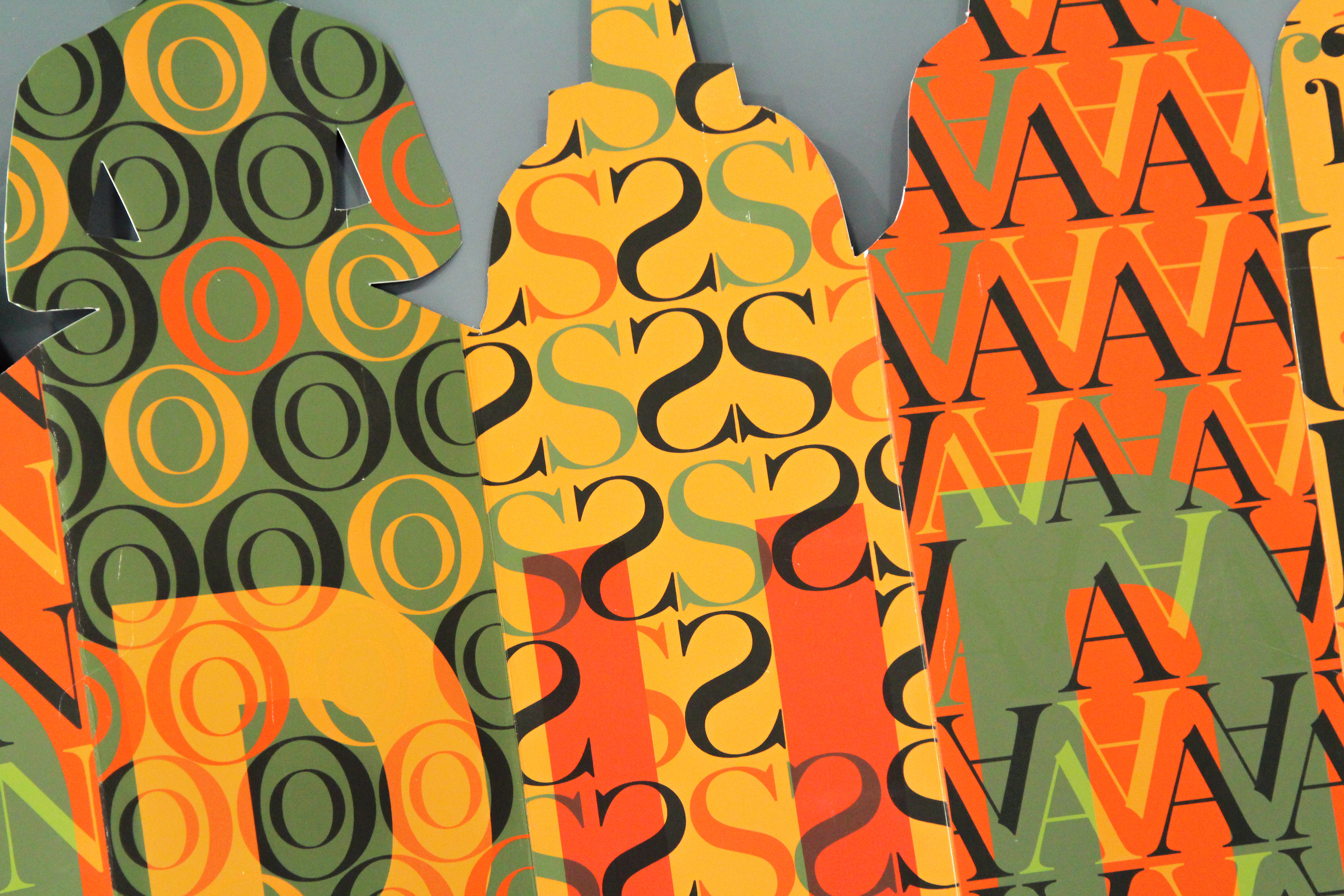
The front calendar only shows six months (July-December). All the shapes above, are based on the month itself.
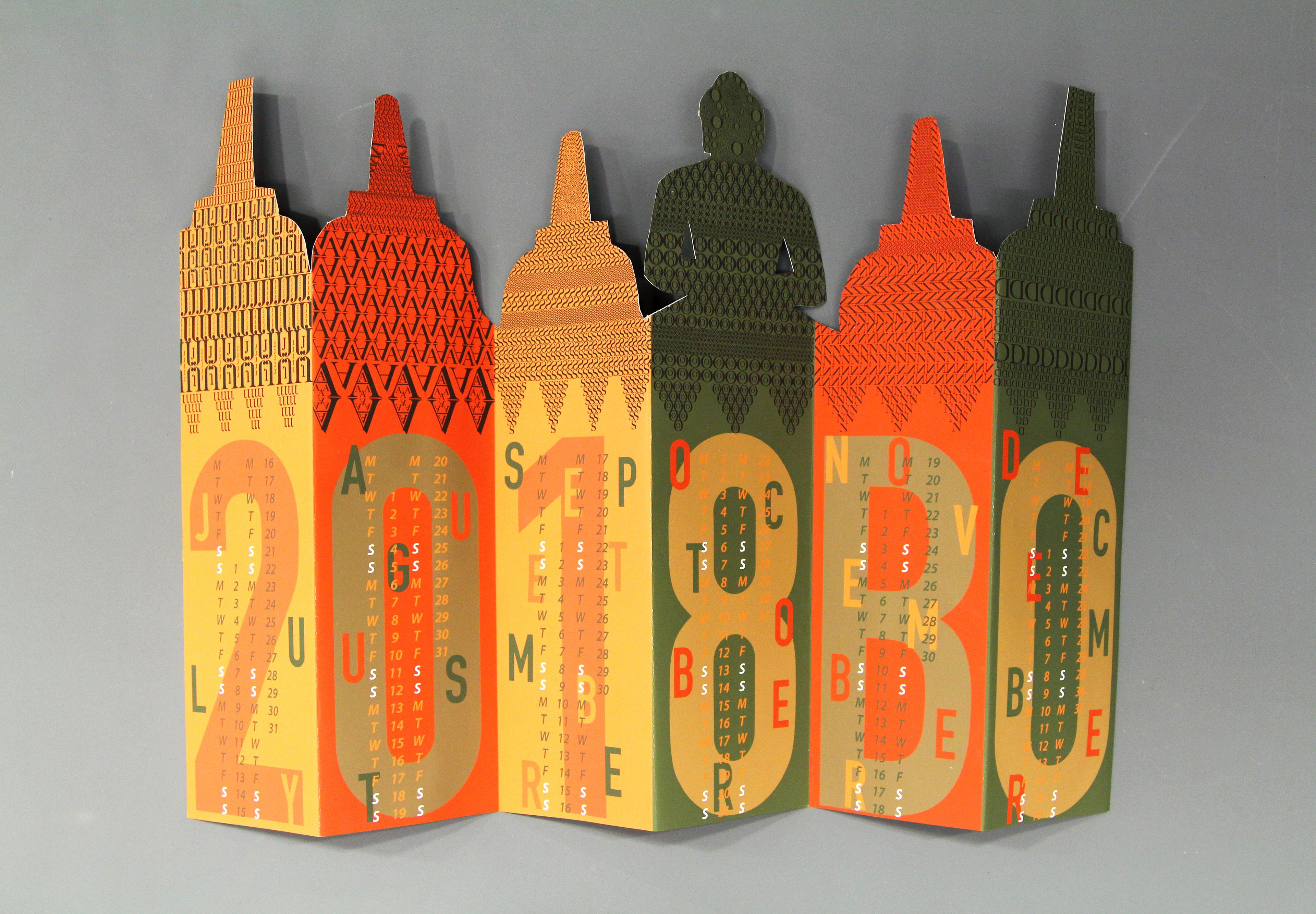
The front calendar only shows six months (July-December). The year of the calendar is 2018 and the 'BO' is from the word and location "Borobudur". The continuation is at the back of the calendar.
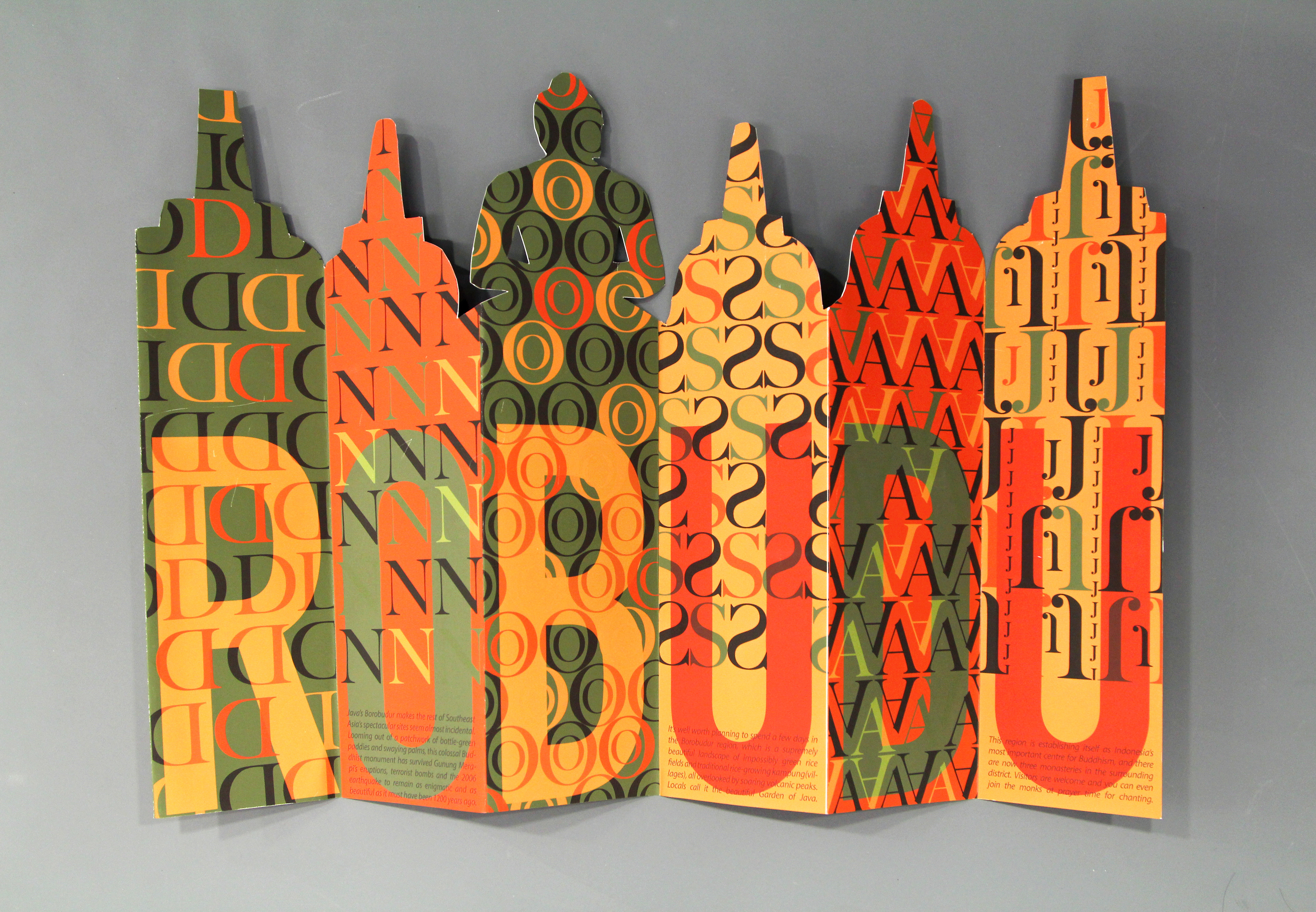
This is the back of the calendar, the continuation of the world "Borobudur".
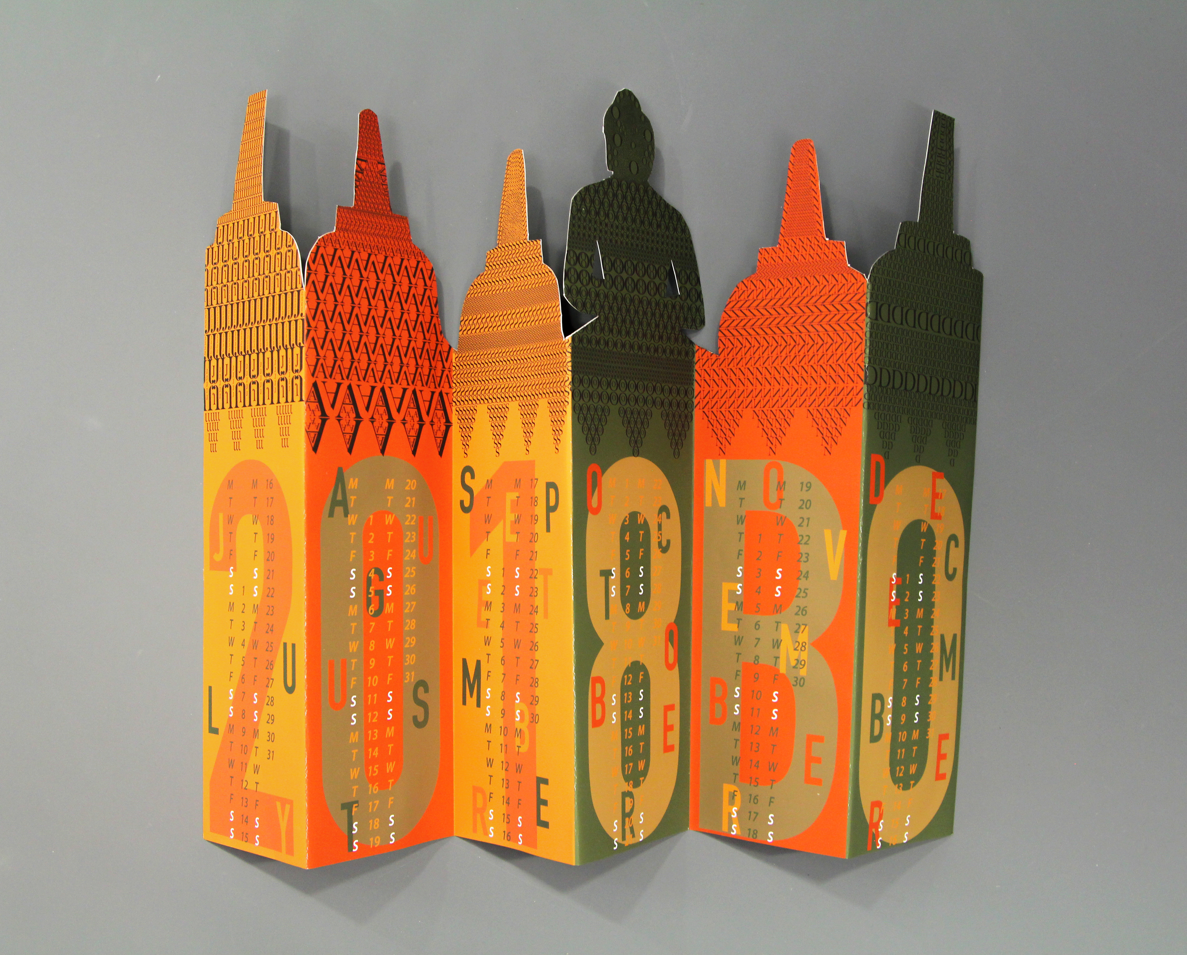
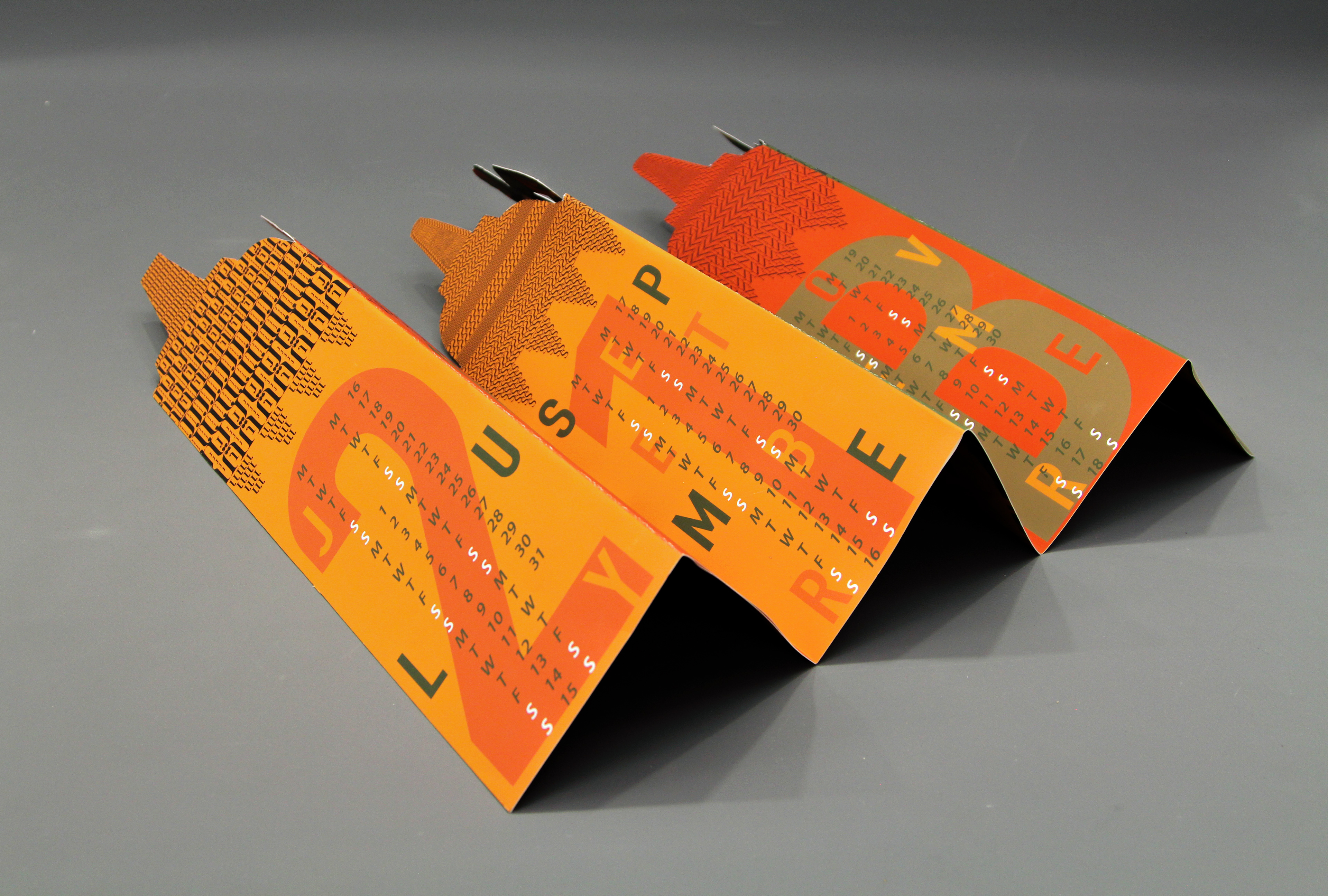
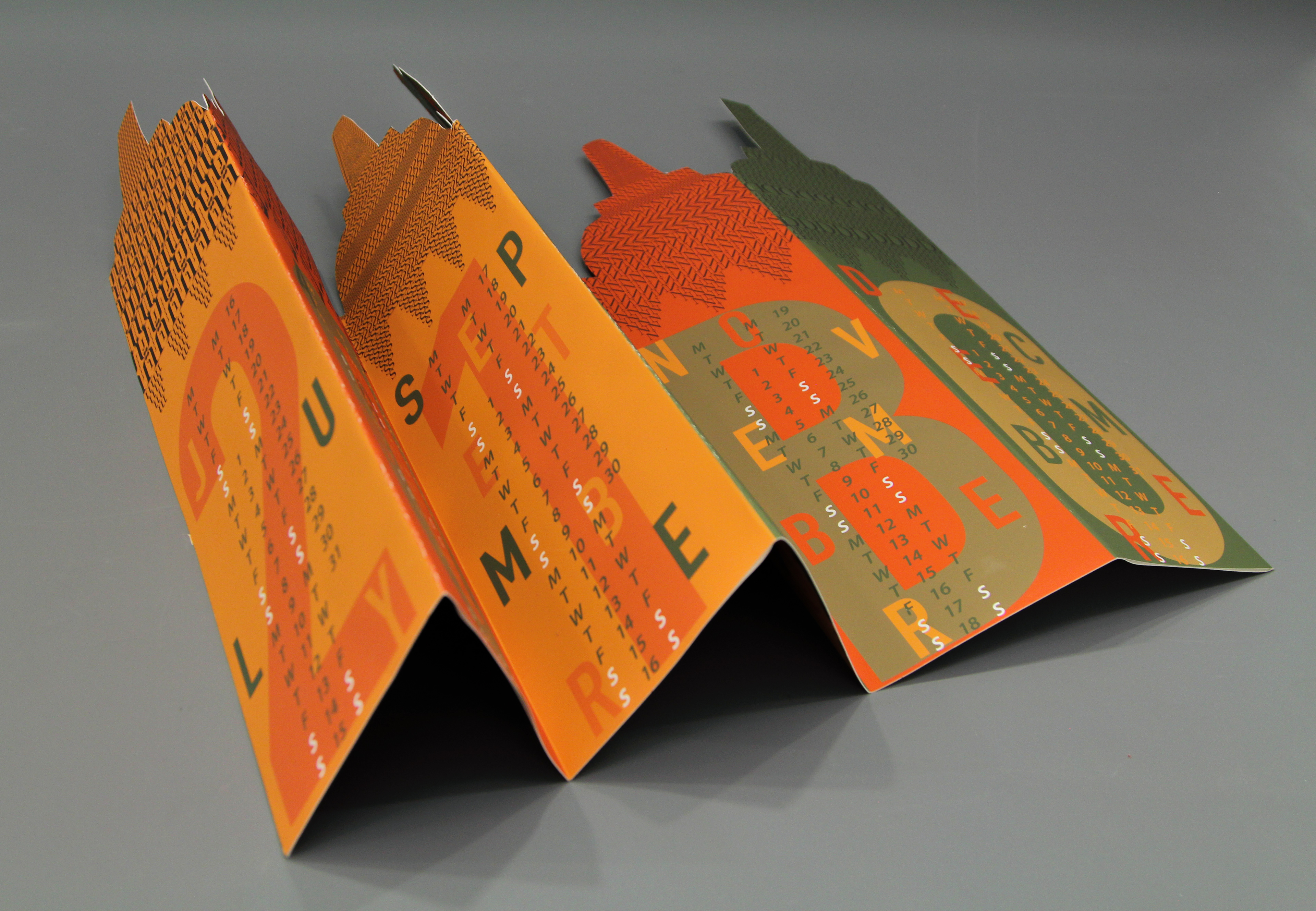
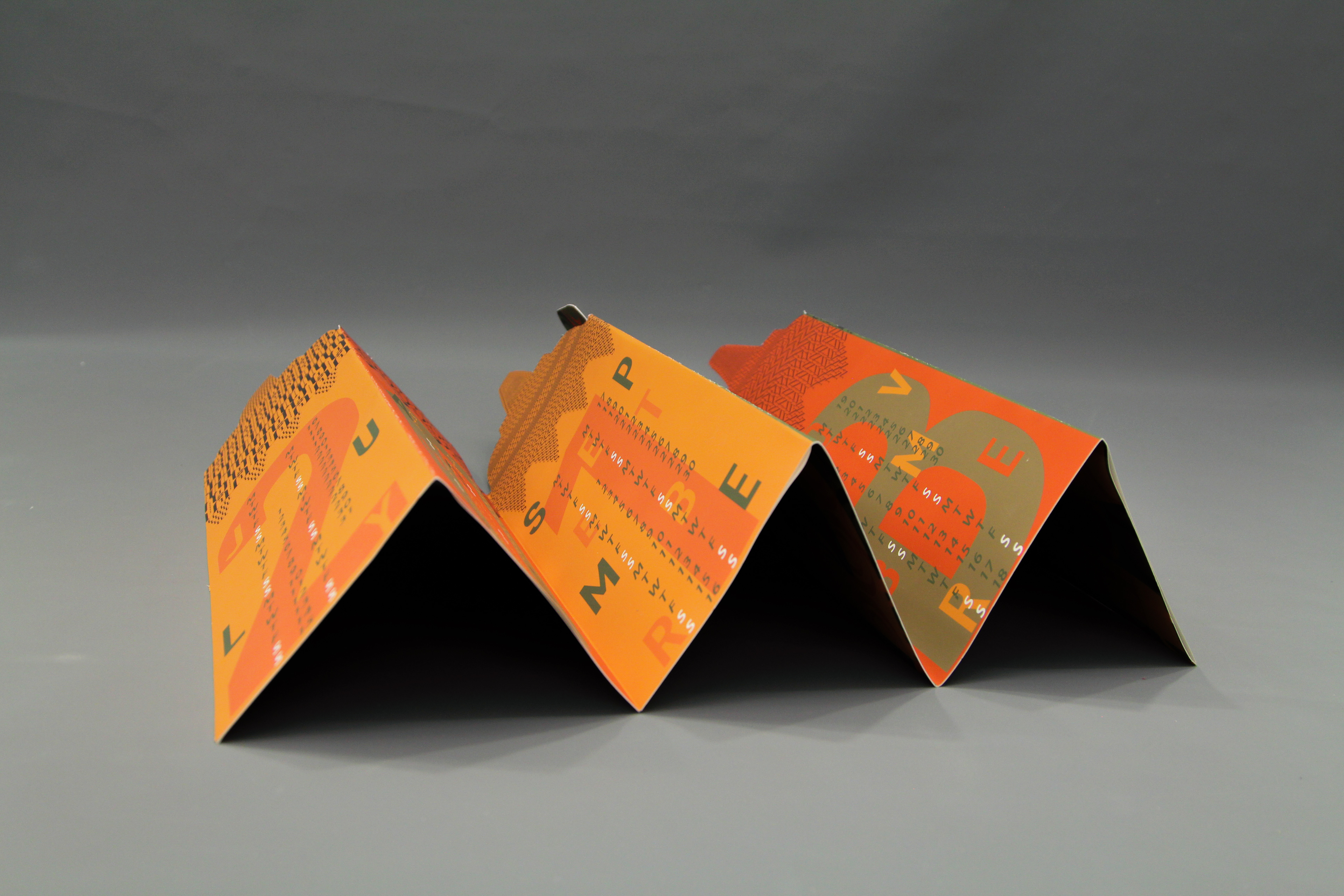
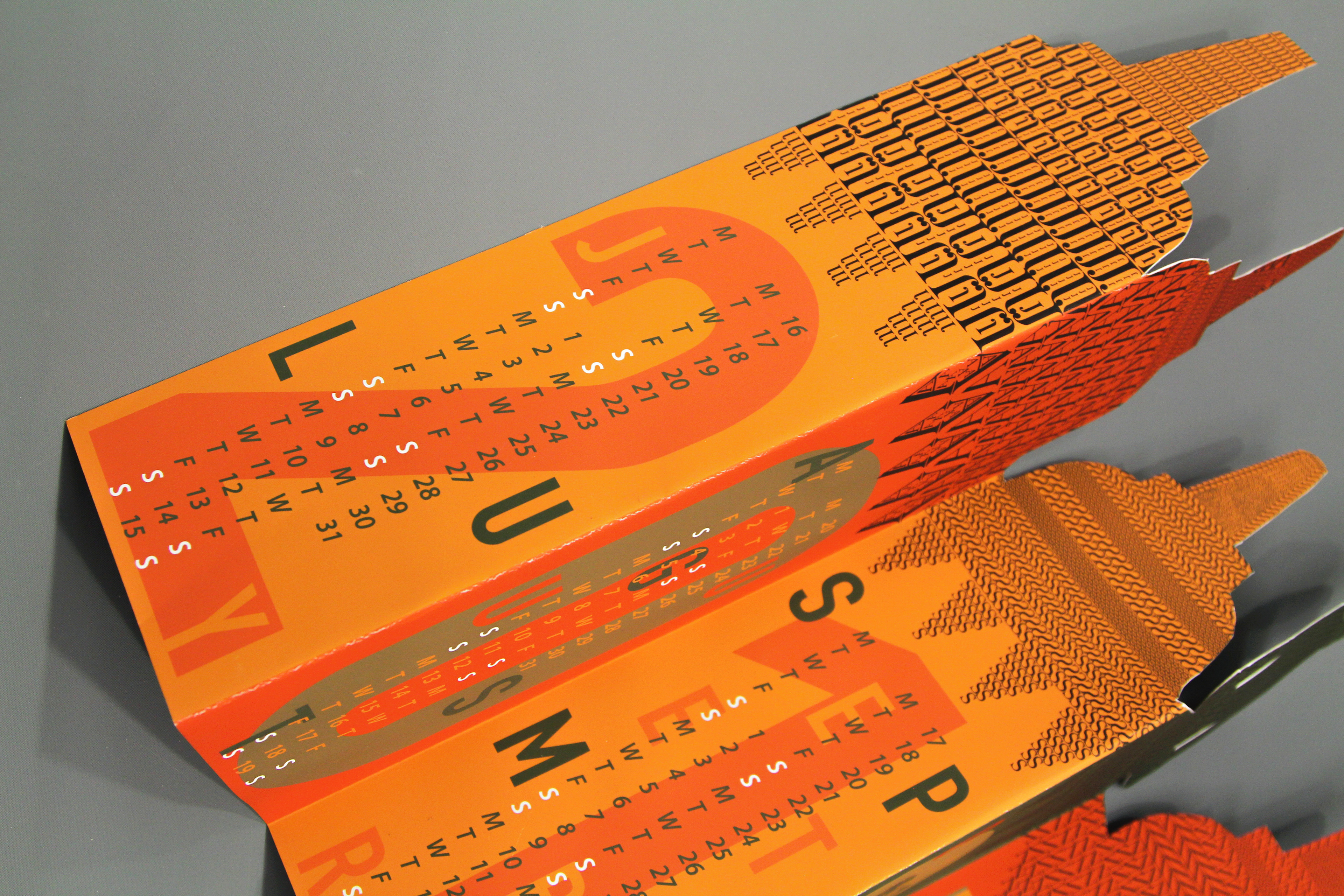
Reading the calendar is easy. The full days aren't written but the two "S's" are meant to mean Saturday and Sunday, and to make it easier they are also written in white.
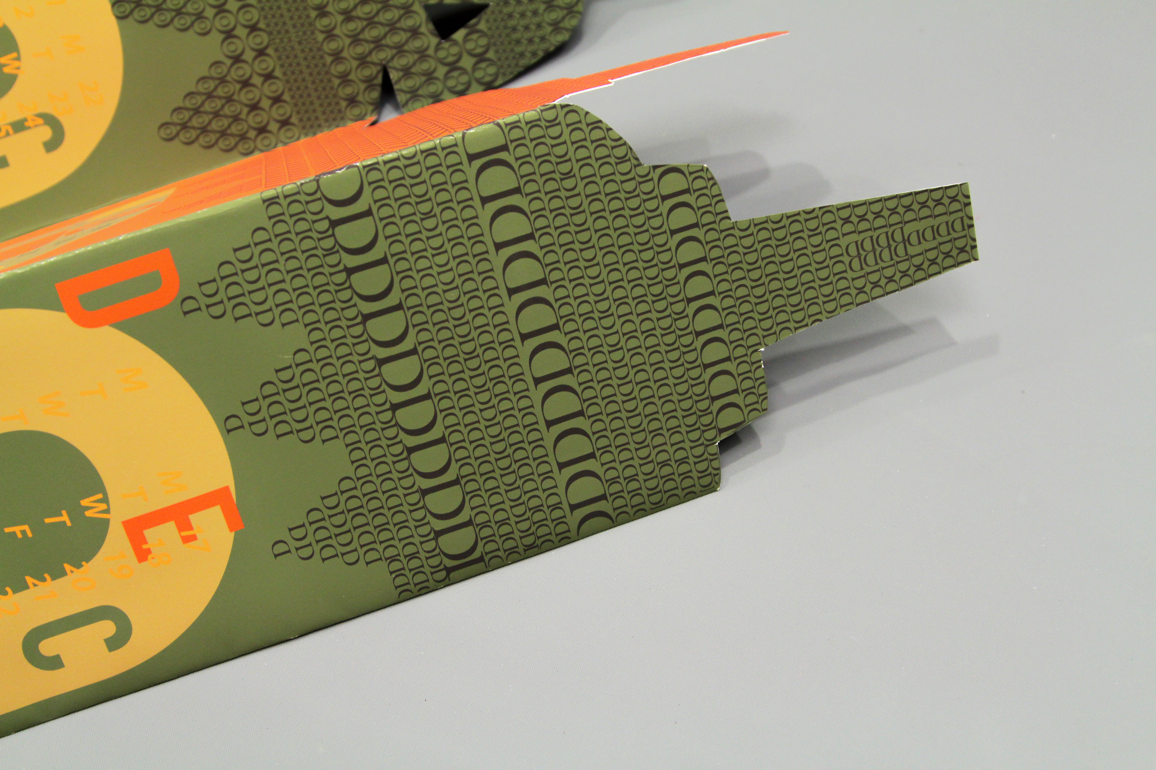
"D" is for December. The design is made up entirely of the letter "D".
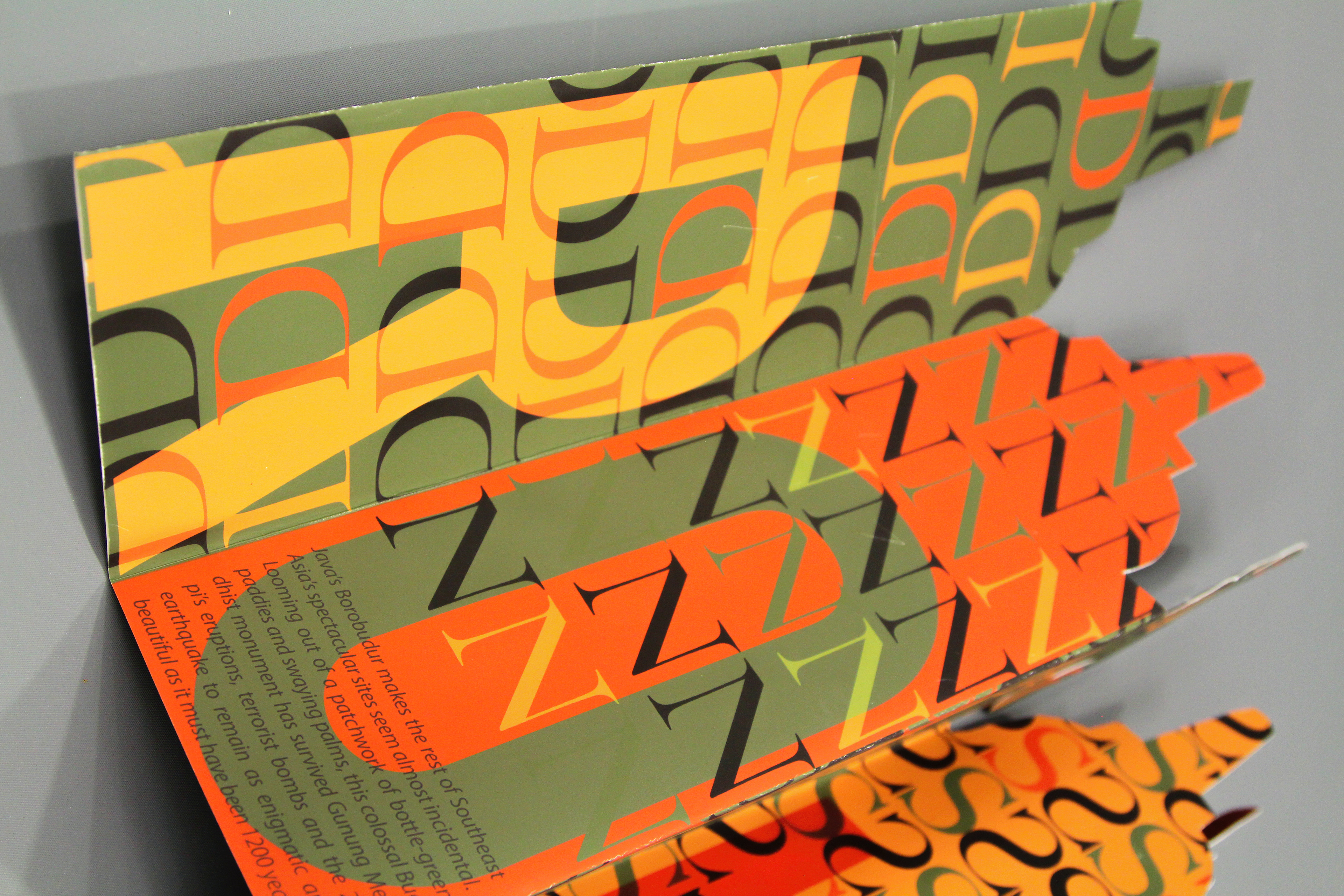
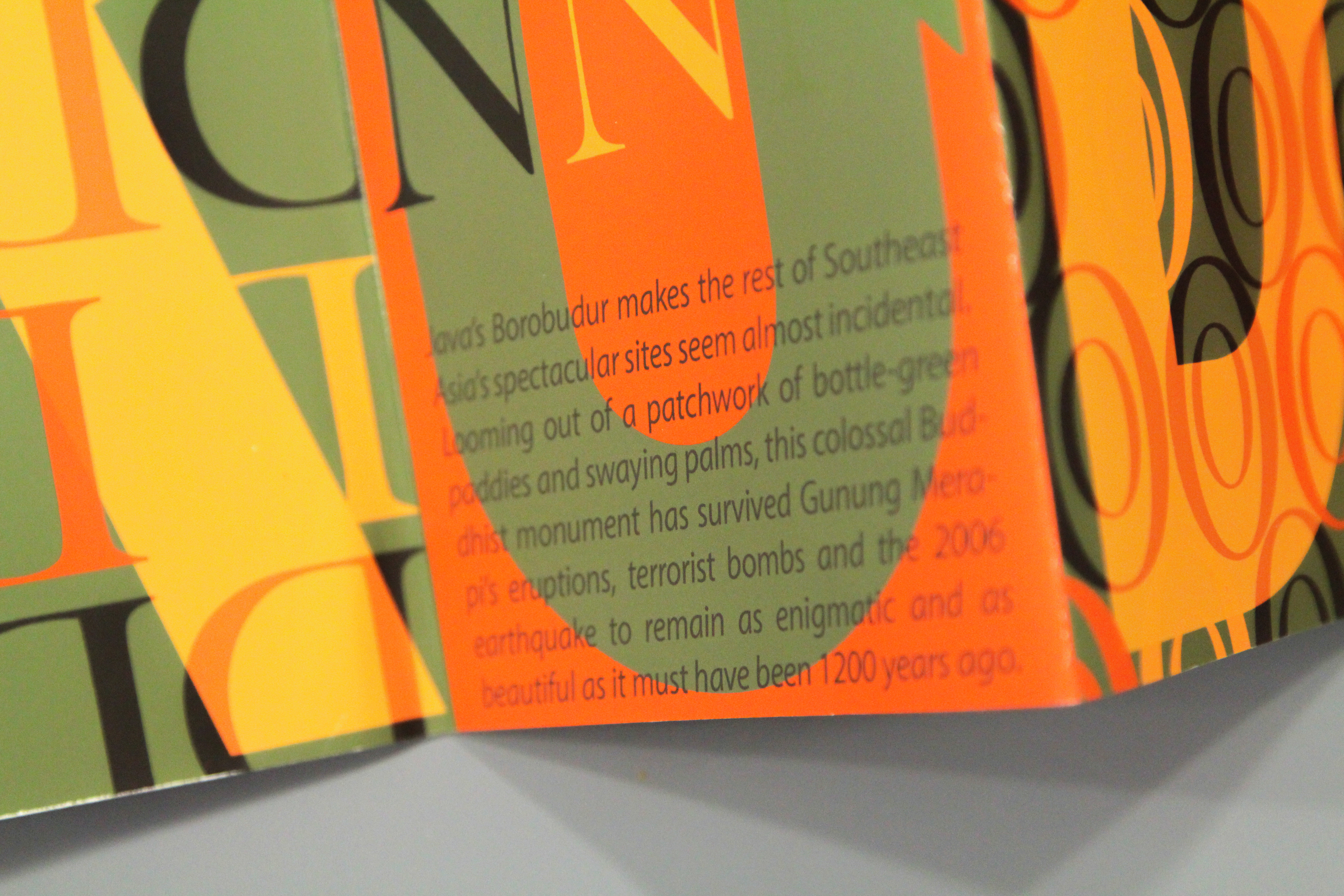
At the back of the calendar, right at the bottom. Some information and facts about the location; Borobudur is written.
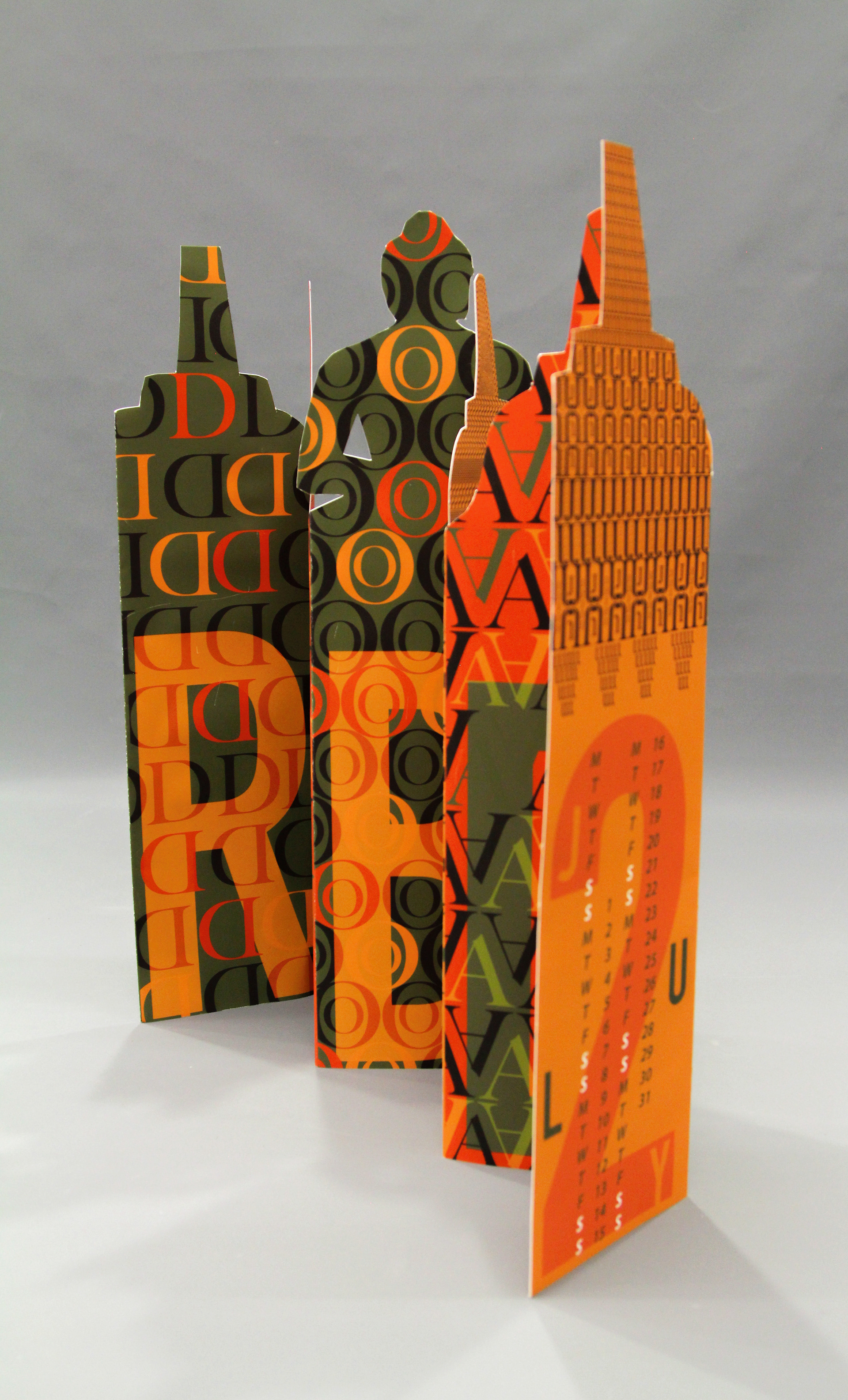
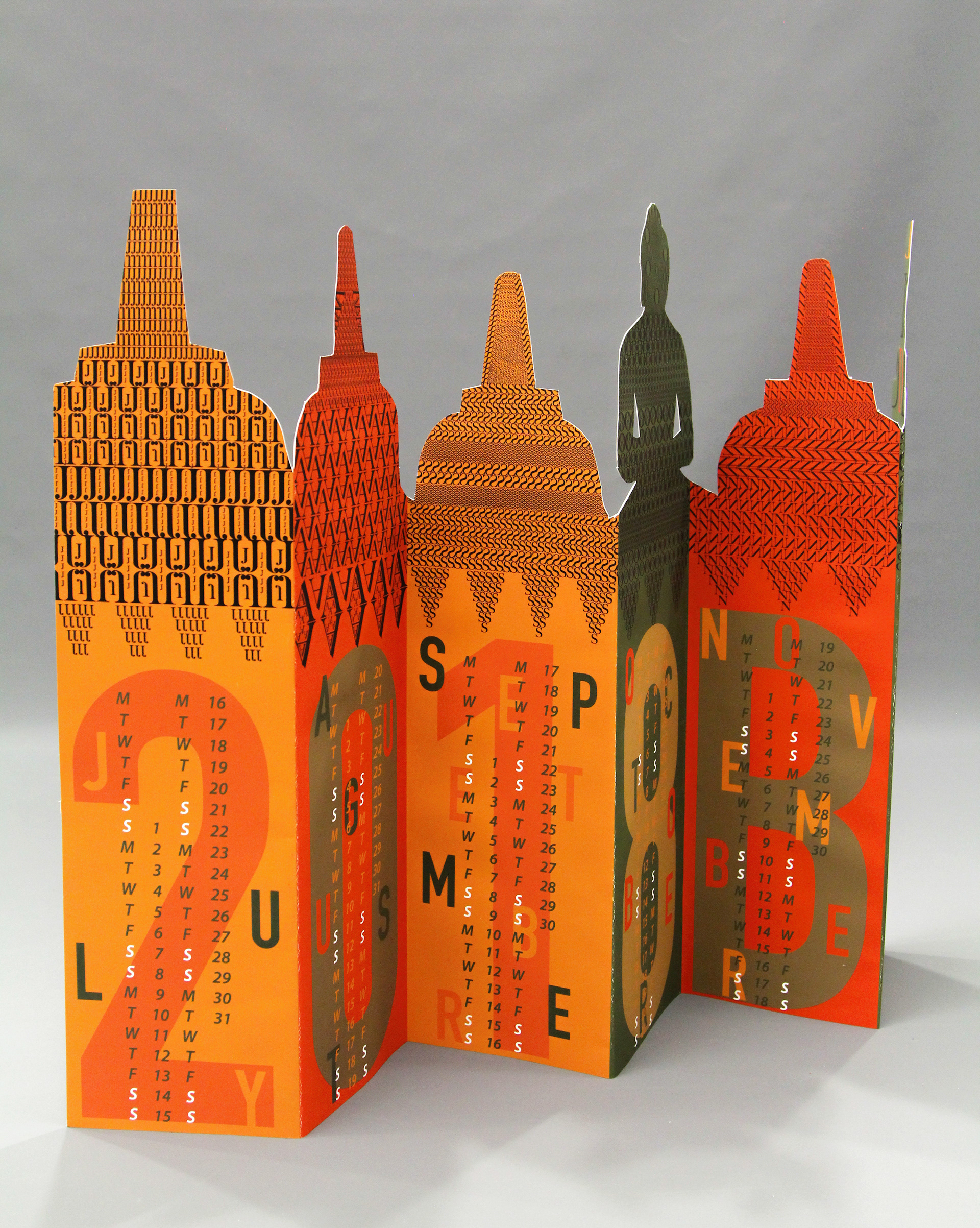
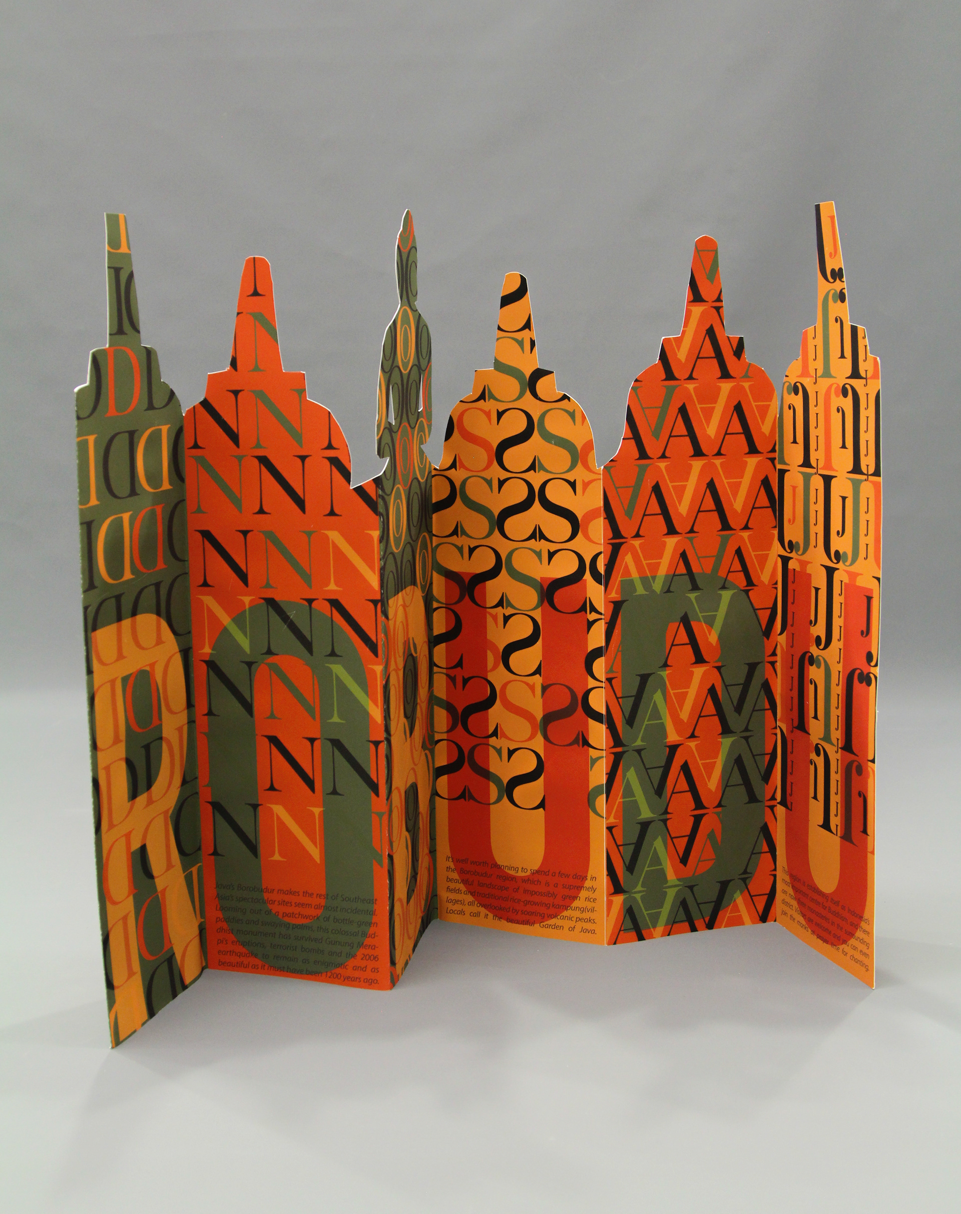
The overall shapes I designed for the calendar are based of the temple complex itself but a little altered. One Buddha and five circular platforms topped by a central dome.